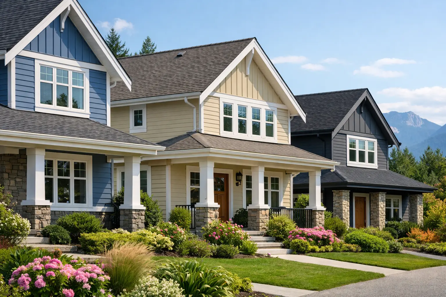
A siding colour can make a well-built home look sharper, newer, and more valuable from the street – or make quality details disappear. The best siding colors for curb appeal do more than follow a trend. They suit the home’s architecture, work with the roof and trim, and continue to look clean and intentional through wet coastal seasons.
For Vancouver Island homeowners, colour selection is also a practical exterior decision. Rain, tree cover, salt air in some areas, and changing natural light can alter how a colour looks from one month to the next. Choosing well starts with the home you have, not a small paint chip viewed indoors.
Start With the Fixed Exterior Elements
Siding is a major visual surface, but it is not the only one. Before comparing colours, look closely at the elements that are costly or difficult to change: roofing, stone or brickwork, window frames, garage doors, and permanent decking or fencing near the home.
Roof colour deserves particular attention. A charcoal or black roof works comfortably with a wide range of siding, including warm whites, pale greys, muted greens, and natural wood tones. Brown roofs usually pair better with warm neutrals, creams, taupes, soft greens, and earthy blue-greys. If the roof has visible brown, red, or green undertones, the siding should acknowledge them rather than fight them.
Also consider the undertone within the siding itself. Two colours may both be described as grey, but one can lean blue and another can lean beige. The difference becomes obvious beside white trim, black gutters, or a warm-toned roof. A professional exterior sample review is useful here because siding panels reflect light differently than flat paint swatches.
Best Siding Colors for Curb Appeal: Proven Choices
The right colour depends on the property, but several options consistently create a strong, lasting impression on West Coast homes.
Warm white and soft cream
A warm white exterior is clean without looking stark. It works especially well on traditional homes, farmhouses, cottages, and homes with dark roofing or black window accents. In a wooded setting, warm white helps the home stand out from heavy greenery while retaining a natural feel.
Pure bright white can look crisp in direct sunshine, but it may appear cold, bluish, or dirty in shaded and rainy conditions. A restrained cream, ivory, or off-white is usually more forgiving and gives the exterior more depth. Pair it with charcoal, deep green, or black accents for definition.
Greige and taupe
Greige sits between grey and beige, which makes it one of the most adaptable siding colours available. It feels current without being tied to a short-lived trend, and it performs well beside stone, wood features, dark roofing, and a range of trim colours.
Taupe brings a little more warmth and is particularly effective for homes surrounded by evergreens, mature landscaping, or natural rock. These colours are less likely than very pale grey to look washed out under overcast skies. They also tend to hide everyday dust and splash marks better than brighter finishes.
Coastal blue-grey
Blue-grey siding has a natural fit with coastal architecture and can give a house a composed, well-maintained appearance. The strongest choices are muted rather than highly saturated. Think slate blue, stormy blue-grey, or a softened steel blue instead of a bright nautical blue.
This family works well with white or light cream trim and can be balanced with a medium-to-dark grey roof. The trade-off is that blue undertones may become more pronounced on cloudy days. Test full-size samples on multiple sides of the house before committing, particularly if the property receives limited direct sun.
Muted sage and forest green
Green siding has become a dependable option for homes that need to sit comfortably within a natural landscape. Soft sage is calm and welcoming, while deeper forest green creates a more substantial, architectural look. Both can complement wood accents, stone bases, and dark roofing exceptionally well.
The key is restraint. Very yellow green can appear dated, and an overly dark green may make a small or heavily shaded home feel smaller. A muted green with grey undertones generally holds up best visually through changing weather and seasons.
Charcoal and deep grey
Deep grey siding offers a modern, confident look and gives white window trim, natural wood, and metal details real contrast. It is often a strong fit for contemporary homes, updated split-levels, and properties with clean rooflines.
Dark siding does require an honest assessment of the home’s setting. It can show pollen, salt residue, and water spotting more readily than a mid-tone colour. On a home surrounded by dense trees or with a north-facing façade, charcoal can also absorb visual light. Breaking it up with lighter trim, a wood entry feature, or a stone accent prevents the exterior from feeling flat.
Use Trim to Create Definition, Not Distraction
Trim is where a colour plan becomes finished. It frames windows, roof edges, corners, and doors, so it should support the siding rather than compete with it.
White trim remains a reliable choice because it offers contrast without adding another strong colour. On warm white siding, however, a slightly deeper trim colour can create the separation that pure white cannot. Soft black, bronze, or dark charcoal trim gives contemporary homes a precise edge, especially when it repeats the roof colour or window frames.
For most homes, limit the exterior palette to three main colour roles: siding, trim, and an accent such as the front door or shutters. More colours can work on detailed heritage architecture, but they need a clear reason. A busy palette can make even new siding look less refined.
Consider Light, Moisture, and Maintenance
Colour samples should be viewed outdoors at morning, midday, and late afternoon. Check them on the front, side, and rear elevations if each receives different light. A colour that looks balanced in full sun may look dramatically darker beneath a covered entry or under tree canopy.
Moisture does not mean homeowners must avoid darker colours, but it does make material quality and installation details matter more. Proper flashing, drainage planes, ventilation, and carefully finished transitions protect the wall assembly behind the siding. Good workmanship keeps an attractive exterior from becoming a maintenance concern.
Mid-tone colours are often the most practical option for busy households. They provide enough contrast to show the home’s shape, hide ordinary road dust and rain splash better than very light colours, and do not show every mark as clearly as near-black siding. The best choice is not always the boldest one from the sample board.
Match the Colour to the Home’s Style
Architecture should guide the final direction. Craftsman homes often suit earthy greens, warm greiges, taupes, and natural wood detailing. Coastal cottages look at home in soft white, blue-grey, or faded sage. Modern homes can carry charcoal, deep green, crisp off-white, and strong contrast around windows and doors.
For a resale-minded update, restraint usually pays off. A neutral main colour with a considered front-door accent appeals to more buyers than a highly personal exterior palette. That does not mean every home needs to be grey. It means the colour should look intentional, appropriate to the neighbourhood, and connected to the home’s permanent materials.
Make the Decision With Full-Size Samples
Small samples are useful for narrowing options, not for making the final call. Order or create large test areas and place them near the roof, trim, front door, and any masonry. Stand at the curb as well as at the entry. Curb appeal is judged from a distance first, where contrast and proportion matter more than subtle undertones.
If the siding project includes repairs, new soffits, or replacement trim, choose the full exterior system together. DryTek approaches siding work with that level of detail because clean finishing and properly coordinated materials are what make the colour look complete once the project is done.
A siding colour should still feel right after a week of rain, a bright summer afternoon, and several years of daily use. Choose one that complements the home rather than chasing attention, then give it the installation quality needed to keep that first impression intact.
Leave a Reply